2013年6月16日日曜日

[Python][matplotlib]区間横棒グラフ

0 から開始ではなく途中からの横棒グラフを描くには broken_barh() を使う
# -*- coding:utf-8 -*-
# broken_barh
import numpy
import matplotlib.pyplot

########################################################################
## Main function
########################################################################
ind = numpy.arange(8)
matplotlib.pyplot.axis([0, 10, 0, 10])
matplotlib.pyplot.grid(True)
# xranges: (xmin, xwidth)
# yrange: (ymin, ywidth)
# 左下:(1, 1), 右上:(2, 4)
matplotlib.pyplot.broken_barh([(1, 1)], (1, 3))
# 左下:(3, 3), 右上:(6, 4)
matplotlib.pyplot.broken_barh([(3, 3)], (3, 1), facecolor='red')
matplotlib.pyplot.savefig('test15.png')

[Python][matplotlib]横棒グラフ

横棒グラフを描く場合は barh() を使う
# -*- coding:utf-8 -*-
# barh
import numpy
import matplotlib.pyplot

########################################################################
## Main function
########################################################################
tokyo = [7.0, 6.5, 9.1, 12.4, 19.0, 23.6,
28.0, 29.6, 25.1, 18.9, 13.5, 9.9]
ind = numpy.arange(1, 13)

# 横棒グラフ
matplotlib.pyplot.barh(ind, tokyo)
matplotlib.pyplot.axis([0, 40, 1, 12])
matplotlib.pyplot.grid(True)
matplotlib.pyplot.savefig('test15-1.png')

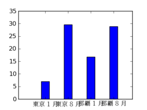
[Python][matplotlib]Grid 付き棒グラフ

# -*- coding:utf-8 -*-
# Grid 付き
import numpy
import matplotlib.pyplot as plt
import matplotlib.font_manager as fm

temperature = (7.0, 29.6, 16.8, 28.9)
ind = numpy.arange(4)
print ind
width = 0.35
p1 = plt.bar(ind, temperature, width, color="b")

# フォントを指定して日本語表示
#prop = fm.FontProperties(fname='C:\\WINDOWS\\Fonts\\ipamp.ttf')
prop = fm.FontProperties(fname='/usr/share/fonts/ipa-pmincho/ipamp.ttf')
plt.xticks(ind + width / 2., (u'東京 1 月', u'東京 8 月', u'那覇 1 月', u'那覇 8 月'), fontproperties=prop)
plt.axis([-1, 4, 0, 35]) # axis([xmin, xmax, ymin, ymax])
plt.grid(True)
#plt.show()

# png 出力
plt.savefig('test06.png')

[Python][matplotlib]棒グラフ

棒グラフを描く場合は bar() を使用する
# -*- coding:utf-8 -*-
# 棒グラフ
import numpy
import matplotlib.pyplot as plt
import matplotlib.font_manager as fm

temperature = (7.0, 29.6, 16.8, 28.9)
ind = numpy.arange(4)
print ind
width = 0.35
p1 = plt.bar(ind, temperature, width, color="b")

# フォントを指定して日本語表示
#prop = fm.FontProperties(fname='C:\\WINDOWS\\Fonts\\ipamp.ttf')
prop = fm.FontProperties(fname='/usr/share/fonts/ipa-pmincho/ipamp.ttf')
plt.xticks(ind + width / 2., (u'東京 1 月', u'東京 8 月', u'那覇 1 月', u'那覇 8 月'), fontproperties=prop)
plt.axis([-1, 4, 0, 35]) # axis([xmin, xmax, ymin, ymax])
#plt.show()

# png 出力
plt.savefig('test05.png')

[Python][matplotlib]複数のファイルに出力する

figure() で figure object を複数作成し、それぞれ savefig() で画像ファイルに出力する
# -*- coding:utf-8 -*-
# 2 つのファイルに出力する
import numpy
import matplotlib.pyplot as plt

t1 = numpy.arange(0.0, 1.0, 0.02)
fig = plt.figure(1)

# 1 rows, 1 column, first plot
plt.subplot(1, 1, 1)
plt.title('sin()')
plt.plot(t1, numpy.sin(2 * numpy.pi * t1), 'k')

# png 出力
fig.savefig('test10-0.png')

# 新しい figure を作成、引数に 1 を渡すと上で作成した fig に追加でグラフを描く
fig = plt.figure(2)

# 1 rows, 1 column, first plot
plt.subplot(1, 1, 1)
plt.title('cos()')
plt.plot(t1, numpy.cos(2 * numpy.pi * t1), 'r')

# png 出力
fig.savefig('test10-1.png')

[Python][matplotlib]複数のグラフを 1 つのファイルにまとめる

figure() で figure object を作成し、そこに subplot で描画領域を区分けして plot していく
# -*- coding:utf-8 -*-
# 2 つのグラフを表示する
import numpy
import matplotlib.pyplot as plt

def f(t):
    return numpy.exp(-t) * numpy.cos(2 * numpy.pi * t)

t1 = numpy.arange(0.0, 5.0, 0.1)
t2 = numpy.arange(0.0, 5.0, 0.02)
fig = plt.figure(1)

# 2 rows, 1 column, first plot
plt.subplot(2, 1, 1)
plt.plot(t1, f(t1), 'bo', t2, f(t2), 'k')

# 2 rows, 1 column, second plot
plt.subplot(2, 1, 2)
plt.plot(t2, numpy.cos(2 * numpy.pi * t2), 'r--')

# png 出力
fig.savefig('test08.png')


4 つ載せる場合
# -*- coding:utf-8 -*-
# 4 つのグラフを表示する
import numpy
import matplotlib.pyplot as plt

t1 = numpy.arange(0.0, 1.0, 0.02)
fig = plt.figure(1)

# 2 rows, 2 column, first plot
plt.subplot(2, 2, 1)
plt.title('sin()')
plt.plot(t1, numpy.sin(2 * numpy.pi * t1), 'k')

# 2 rows, 2 column, second plot
plt.subplot(2, 2, 2)
plt.title('cos()')
plt.plot(t1, numpy.cos(2 * numpy.pi * t1), 'r')

# 2 rows, 2 column, third plot
plt.subplot(2, 2, 3)
plt.title('tan()')
plt.plot(t1, numpy.tan(2 * numpy.pi * t1), 'b')

# 2 rows, 2 column, fourth plot
plt.subplot(2, 2, 4)
plt.title('log()')
plt.plot(t1, numpy.log(t1), 'g')

# png 出力
fig.savefig('test09.png')

[Python][matplotlib]出力するグラフのサイズを指定

  • figure() と subplot() を使用して出力サイズ (pixel) を指定する
  • figure で 4x3 inch に出力する指示をし、その figure object に subplot でグラフを描く
  • ファイル出力する時 (savefig) に、100dpi と指定すれば 400 x 300 pixel となる
# -*- coding:utf-8 -*-
# 400x300 pixel の画像として出力する
import numpy
import matplotlib.pyplot as plt
import matplotlib.font_manager as fm

temperature = (7.0, 29.6, 16.8, 28.9)
ind = numpy.arange(4)
print ind
width = 0.35
fig = plt.figure(figsize=(4, 3))
plt.subplot(111)
plt.bar(ind, temperature, width, color="b")

# フォントを指定して日本語表示
#prop = fm.FontProperties(fname='C:\\WINDOWS\\Fonts\\ipamp.ttf')
prop = fm.FontProperties(fname='/usr/share/fonts/ipa-pmincho/ipamp.ttf')
plt.xticks(ind + width / 2., (u'東京 1 月', u'東京 8 月', u'那覇 1 月', u'那覇 8 月'), fontproperties=prop)
plt.axis([-1, 4, 0, 35]) # axis([xmin, xmax, ymin, ymax])

# png 出力
fig.savefig('test07.png', dpi=100)